As a UX Manager at Home Depot, I managed the UX team responsible for the Search & Recommendations experience across HomeDepot.com and the Home Depot app. These surfaces had limited design coverage before our team took ownership. I partnered closely with engineering, product, data science, and personalization teams to build a more cohesive, user-centered product discovery experience. Our goal was to modernize how customers find, evaluate, and purchase products online, increasing relevance, personalization, and efficiency while working through technical debt, legacy UI patterns, and inconsistent component usage across platforms. Along the way, we introduced AI capabilities to enhance search ranking and power smarter, more personalized recommendations.
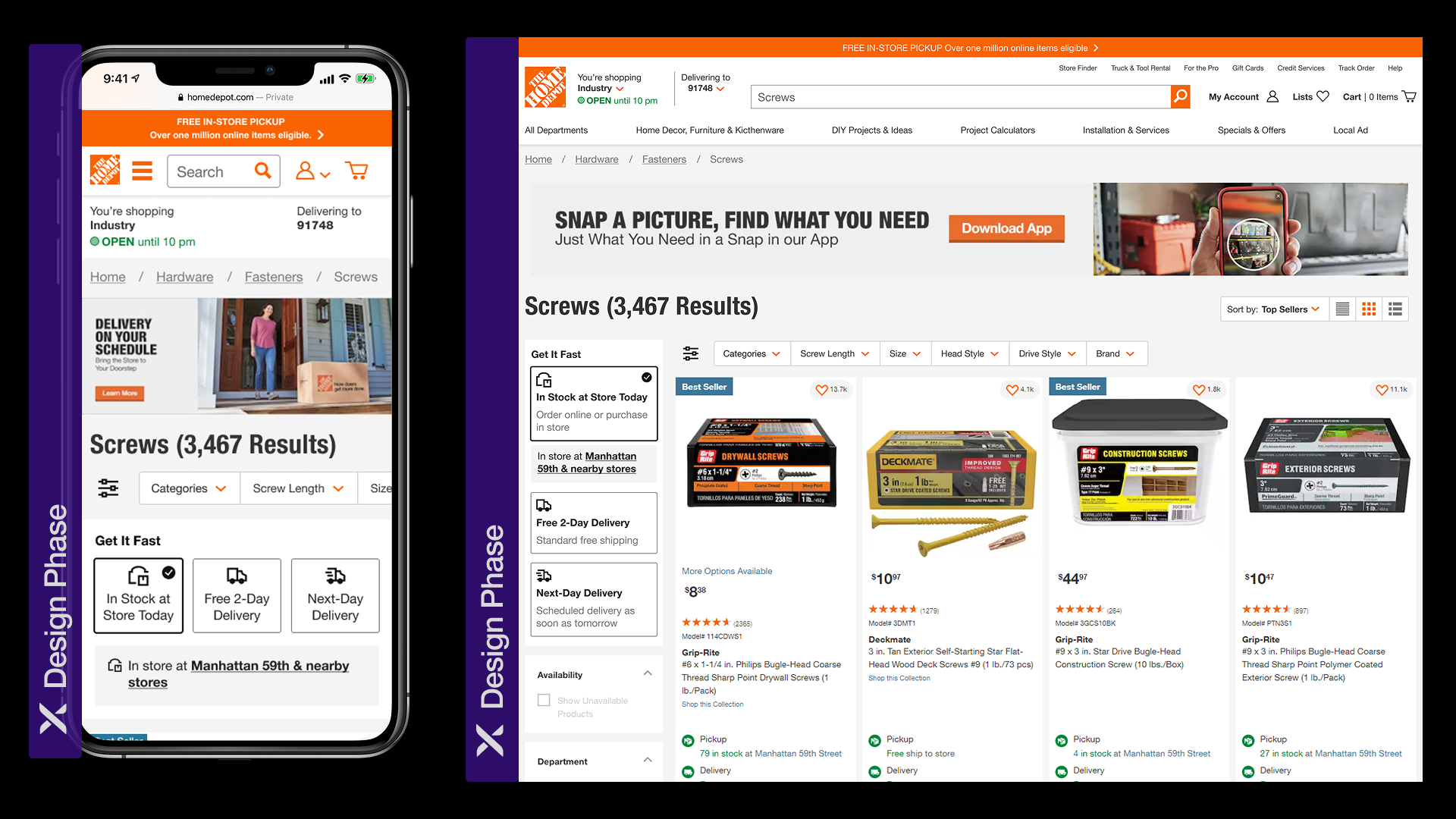
When I took on this work, the experience was falling short. Filters were outdated, product pods were oversized and ineffective, search lacked typeahead and recent history, and recommendations were irrelevant and overwhelming. Users struggled to find the right products and often left without purchasing. I worked to align previously disconnected workstreams: search ranking, PLP (Product Listing Page) design, and personalized recommendation modules, under a shared UX direction. Managing my team of 8 designers, supported by 3 UX researchers, we delivered a consistent, mobile-first experience that increased search engagement, reduced friction, and drove measurable gains in click-through rate (CTR), average order value (AOV), and revenue per visit (RPV).
User-Centered Research & Strategy
When I took on Search & Recommendations, dedicated UX coverage of these surfaces was still new at HomeDepot.com. The experience was fragmented, outdated, and missing critical features. I led a research strategy to identify friction points, improve relevance, and ensure the product discovery experience met the needs of both B2C shoppers and B2B Pros.
We began our foundational research journey with a comprehensive heuristic audit of the search bar, PLP (Product Listing Page), filters, and recommendation carousels across desktop, mobile, and app. We benchmarked against competitors like Amazon, Walmart, Wayfair, Best Buy, and Lowe's, identifying over 40 usability issues related to visibility, responsiveness, and content priority. For example, filters were buried in an accordion layout, the search experience didn't support recent or suggested terms, and many recommendation modules felt visually overwhelming and poorly targeted.
I facilitated Design Sprints to align the teams and solve user problems. We mapped common B2C and Pro scenarios, such as homeowners shopping for a weekend project versus Pros reordering tools or bulk paint, and highlighted pain points across each phase. We used real feedback from CSAT data and unmoderated UserTesting sessions to inform these maps. Both groups were frustrated by irrelevant recommendations, but Pro users also struggled with search results that excluded bulk options, BOPIS fulfillment, or past orders.
To deepen our understanding, we ran bi-weekly moderated interviews with homeowners, renters, and professional contractors. Using affinity mapping, we uncovered five consistent frustrations:
- Lack of typeahead or autosuggestions in the search bar made common queries harder to execute
- The size of the search bar was too small, especially on mobile devices
- Customers expected to see recent searches or popular terms, but the feature didn't exist
- B2B Pros needed more precision in search results (e.g. filtering by bulk SKU or in-store)
- Recommendations were impersonal, often promoting unrelated items that felt spammy
- Some searches yielded blank or zero-result pages, which users interpreted as system failure
These findings reinforced that we weren't just missing features, we were losing user trust at decision moments.
To round out our qualitative insights, I partnered our teams with Data Science to embed Quantum Metrics and Adobe Analytics into our research pipeline. This enabled us to monitor real-time behavior, funnel drop-offs, and rage clicks across the Search > PLP > PIP funnel. Key discoveries included:
- The search bar was underutilized, with users defaulting to category navigation instead of trusting typed queries
- Users who did engage with search had higher intent and were 3.2x more likely to convert; search abandonment was high due to irrelevant or empty results
- PLP engagement dropped sharply when product pods were oversized or misaligned with query relevance
- CTR and AOV were significantly higher when customers interacted with contextual recommendations, but usage was low due to poor placement and excessive carousels
We utilized A/B testing and first-click testing to validate design decisions quickly. We tested:
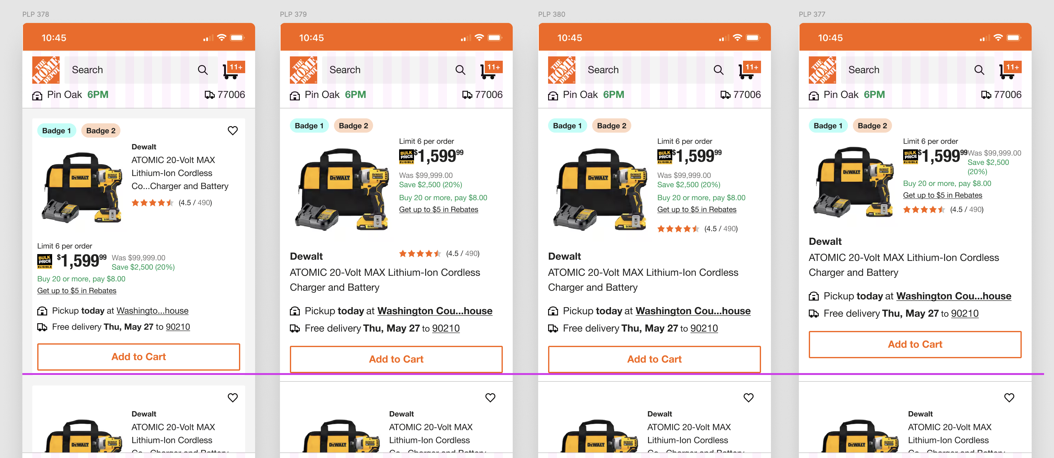
- Compact vs expanded product pods: The compact version improved scroll behavior and raised product information page views by 7%
- Different filter UX models: Placing filters horizontally above the product grid rather than a collapsible sidebar increased filter usage and time on page
- Personalized vs static recommendations: Personalized modules led to a 14% increase in CTR and 10% lift in AOV
Together, these research efforts informed every major redesign decision, from the logic and design of the product pods, to where and how recommendations appeared, to the introduction of AI-powered typeahead and intent prediction.
Agile & Process Optimization
As the UX Manager over Search & Recommendations, I established design practices and rituals for the team, defined success metrics, and worked to embed designers directly into sprint cycles alongside product and engineering.
Before our team had a seat at the table, product and engineering operated without design input. This led to mismatched priorities, poor communication, and experiences that didn't solve real customer problems. I worked to get designers into sprint planning, collaborating on hypothesis building and reviewing post-release metrics alongside product managers and data science.
To address persistent gaps in product pod performance and recommendation engagement, we introduced design sprint frameworks across multiple squads. These sprint cycles included Design Thinking workshops, validation testing via UserTesting, and cross-functional playback sessions.
To drive consistency and accelerate Design System adoption, I created a recurring forum for my team and partners across the Search and Recommendations space to share in-flight work, increase alignment, reduce blockers, and provide updates as changes to the Design System were adopted. This feedback loop strengthened our Design System integration and built a unified understanding of user needs. What started as a Search initiative was adopted across the broader UX org, becoming a model for scalable collaboration.
I collaborated with Data Science, Product, and Engineering stakeholders to help define UX success metrics for both search engagement and recommendation performance. These KPIs were used to prioritize our backlog, gain stakeholder alignment, and defend roadmap investments:
- Search bar interaction rate and return visit lift
- Filter usage and completion rate
- Product pod CTR
- Recommendation CTR
- Bounce rate reduction on zero-result pages
These metrics helped us move stakeholder conversations away from subjective UI preferences and toward measurable experience quality. Our success became tied to how well the design performed, not just how it looked, which helped build credibility for the team and secure continued investment in UX-driven improvements.
- Compact Product Pods: Led the complete redesign of product pods on search and category (PLP) pages. Based on user testing and analytics, we reduced visual clutter, prioritized the most actionable content (ratings, price, fulfillment), and introduced tap targets that improved the ability to scan quickly. Despite stakeholder hesitation, engagement increased and PIP depth improved by 9%.
- Filter Redesign & Relocation: Replaced the legacy left-rail filter experience with a responsive, top-anchored design. This change, driven by research and validation testing, aligned with modern usability patterns and freed screen space for product content. The result was a 14% increase in filter interaction rate and improved task completion.
- Personalized Recommendations Strategy: Partnered with our Personalization team to overhaul product recommendations. We eliminated redundant carousels, aligned modules with user intent and category context, and introduced AI-driven personalization. These changes improved CTR by 18% and raised average order value in sessions with recommendations by 11%.
- Search Bar Improvements: Defined and led enhancements to the search bar UX, including the introduction of typeahead, recent searches, and search suggestions. We also reduced frequent "no result" experiences by redesigning zero-state messaging to include alternate queries and category links. These changes increased search-to-click rates by 10% and reduced bounce rate from zero-result pages.
- AI-Powered Ranking Inputs: Worked with Data Science and Product to integrate AI relevance signals into the search algorithm, surfacing more relevant results based on user behavior patterns. This shift contributed to a measurable increase in return visits and customer satisfaction scores tied to search accuracy.
- Service-Aware Recommendations: Informed by B2B Pro user interviews, we introduced context-aware recommendations that considered professional purchase behavior. For example, searches for bulk paint would return not just similar SKUs but also accessories, safety gear, and scheduling services, improving attachment rate and supporting complex purchase journeys.
- Design System Integration: Championed the migration of all Search & Recommendations to our new Design System and component library. This reduced design-debt-driven engineering overhead and gave us consistency across touchpoints. It also allowed faster iteration and A/B testing of components like filters, search suggestions, and pods.
- Search engagement increased by 15%, with more users leveraging the search bar as their primary navigation method after the introduction of typeahead, recent searches, and predictive suggestions.
- CTR on product recommendations rose by 18%, driven by personalization improvements and the removal of redundant carousels. Users found the remaining recommendations more relevant and actionable.
- Average order value increased by 11% in sessions with recommendations, showing a clear correlation between smarter recommendation surfaces and higher transaction amounts.
- Filter interactions rose 14%, thanks to relocating filters to a top-anchored position, improving usability and screen real estate for mobile, app, and desktop.
- Bounce rate from zero-result pages dropped by 10%, after redesigning those states to include smart suggestions and browse alternatives.
- PIP depth improved by 9% after redesigning product pods to be more compact and scannable, making it easier for users to compare and select products.
- Attachment rate increased among B2B Pros, especially in categories like paint, flooring, and tools, after launching context-aware recommendations and improving package visibility in search.
- Design velocity accelerated through full design system integration. Shared components and variant logic allowed designers to test and ship faster, while maintaining consistency across product pods, recs modules, and filters.